该文章未提交审核, 请编辑完成后提交审核。
该文章未通过审核,感谢您对字由的贡献。
该文章正在审核中,通过后将会自动显示在字说字话页面。
这组包装设计,最大的亮点是字


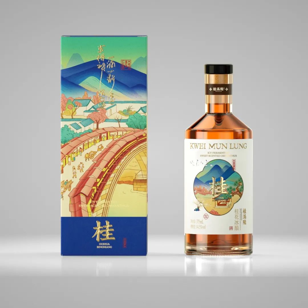
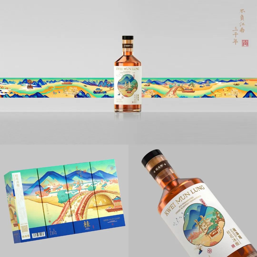
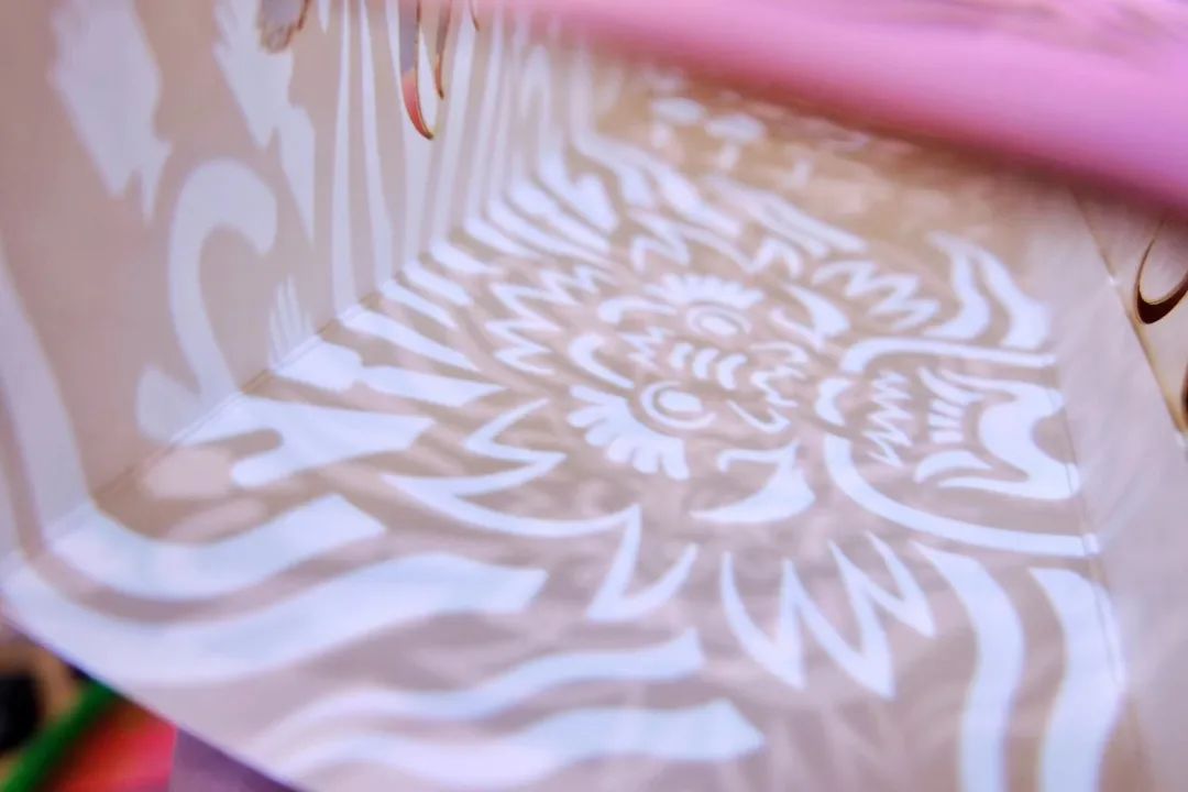
桂满陇的品牌文化核心为“不负江南三千年”,所以我们把江南这片土地上三千年来发生的事重现了一遍,绘成了《千里江南图》。我们从江南图中提取了最具代表性的园林来体现这款产品,而且我们选择了用窗户作为主体来体现园林景观,用一窗一景的方式呈现出了江南最具特色的园林景观。包装盒的四个面拼接成的完整画面,也是对江南园林的完整展开。
The core of KWEI MUN LUNG brand culture is reserving the shining parts in three thousand years history of Jiangnan . So we retell the story of this land during the past years, which forms the 《QianLiJiangNanTu》. We selected the representative part of it, the Garden art of JianNan, to show the products. Meanwhile, the window is chosen to be subject,which can show the special characteristics of JianNan Garden . That’s one window, one different outlook . The four sides of the production box show a complete scenery of 《QianLiJiangNanTu》.


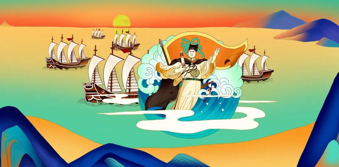
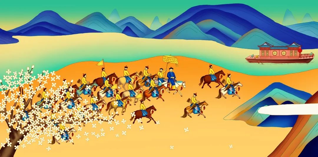

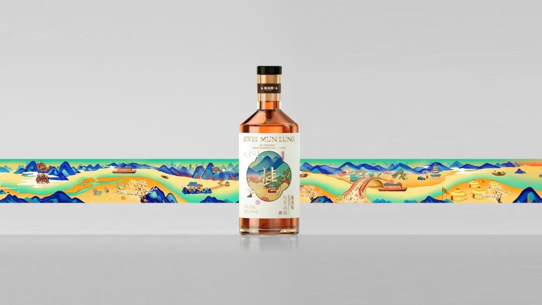

项目: 桂花冰酿包装视觉设计
策略&文案:Mona
设计总监:陈允信
设计师: 徐程恺,林伟淳,梁健和,蒋晟焘


气泡米酒是一款咬金新研发的产品,保留了糯米酒的香甜,同时加入气泡后拥有了碳酸饮料的清爽口感。所以我们在设计时希望消费者能抛下对米酒传统的认知,于是采用了啤酒的方式设计了这款米酒,并且用醒目的中文强调了这款产品最大的卖点和特色就是“气”。而我们之所以用中文繁体的“氣”,正是因为它就是米字与气字结合的。
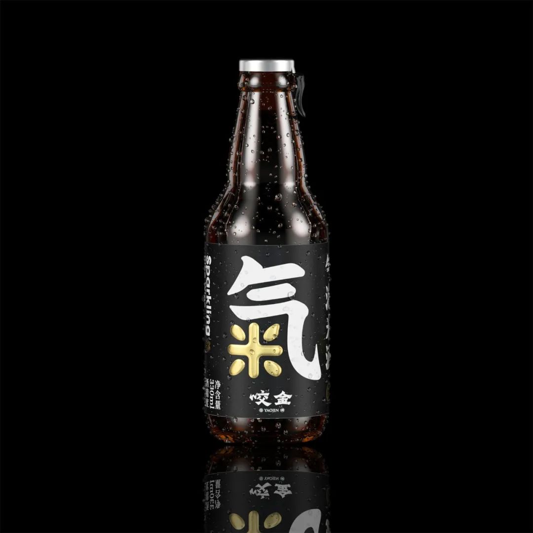
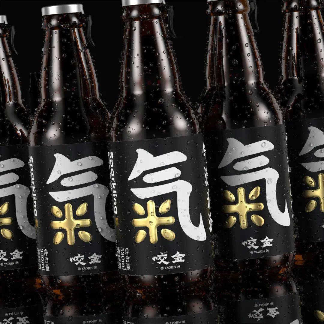
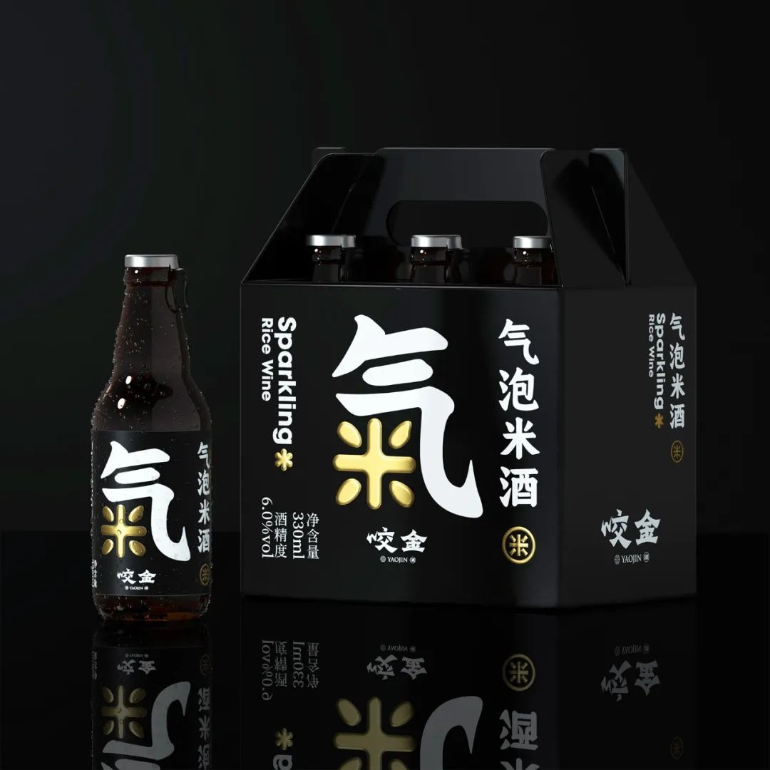
项目: 气泡米酒产品策划&包装设计
产品策划:Mona&陈允信
设计总监:陈允信
设计师: 徐程恺


咬金作为主打唐朝文化的品牌,将众多古代果酒用现代手法进行了重现,而为了更好的凸显唐朝文化,我们把果酒不同的口感进行拟人化,以唐朝侍女为蓝本,运用波普手法pop art将其进行了现代化演绎,就诞生了这个“水果唐妞”系列。同时瓶身经过特殊电镀上色,将波普的颜色融入瓶身,使整体更加统一。
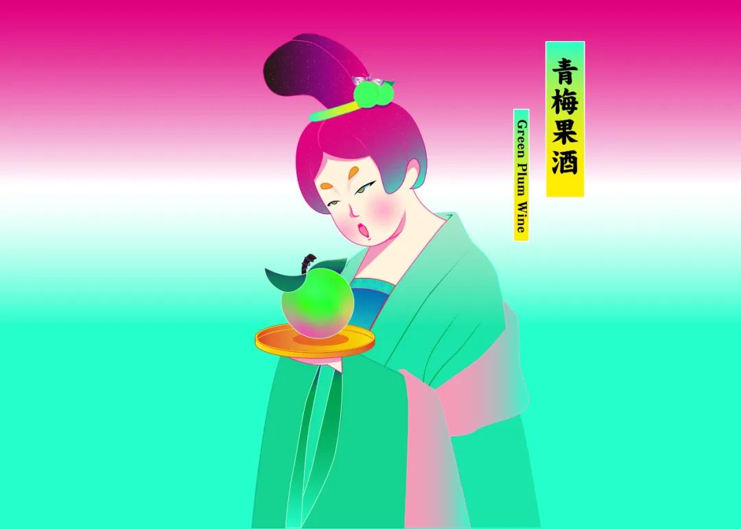
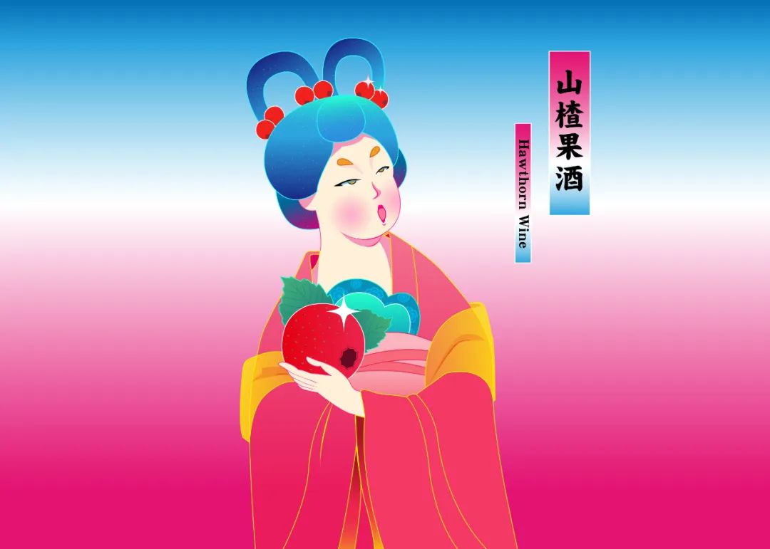
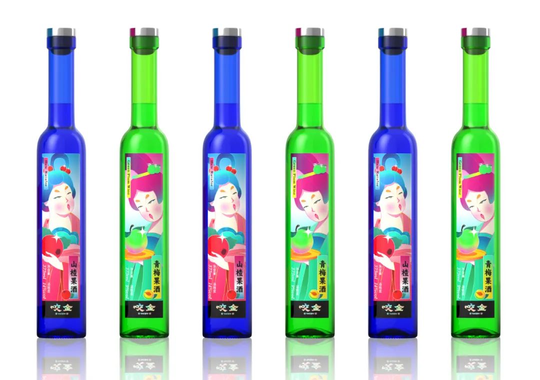
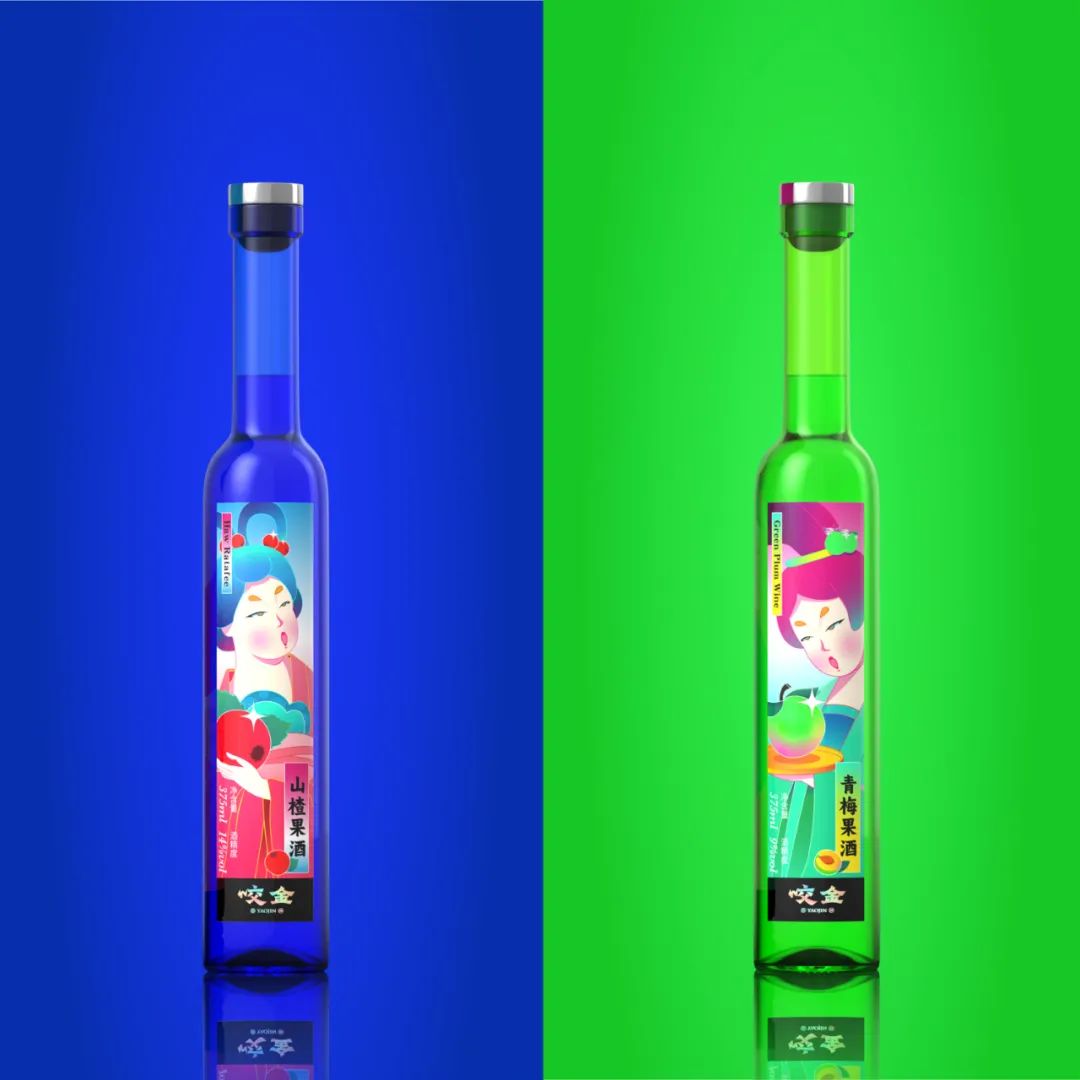
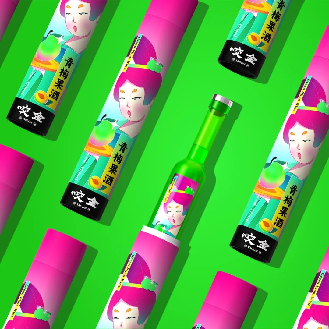
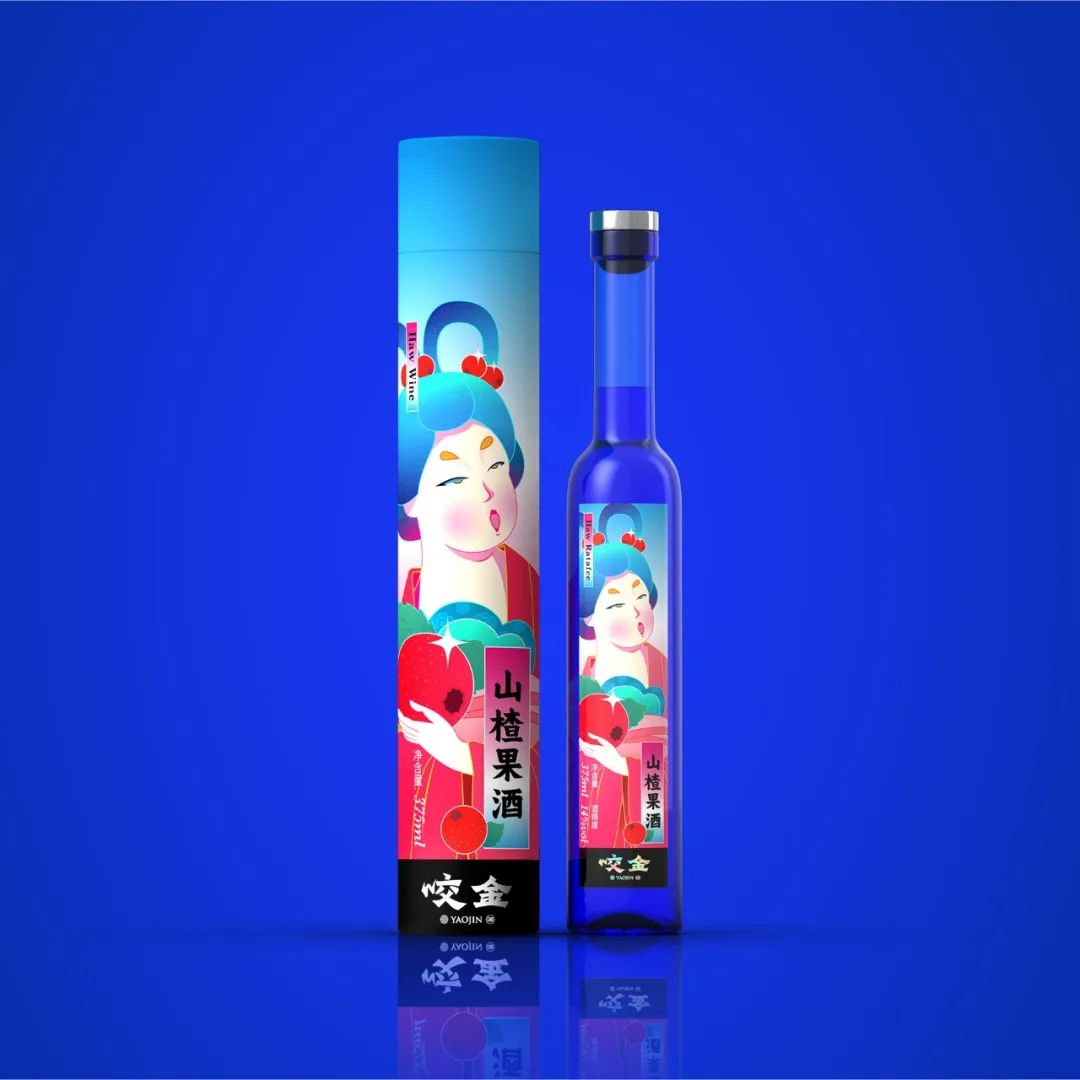
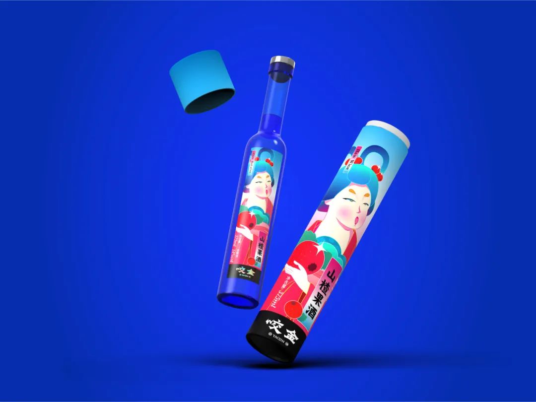
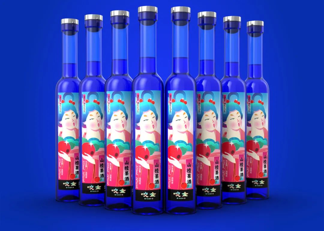
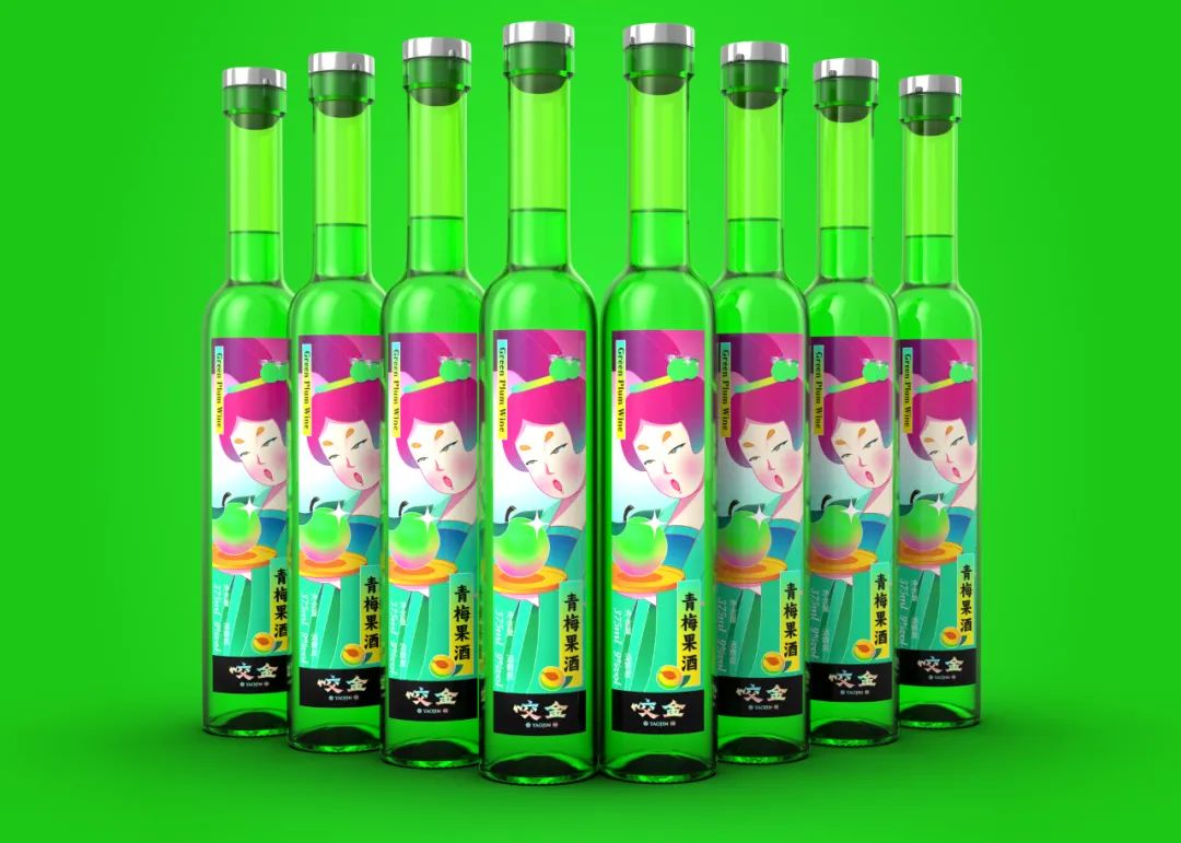
项目: 水果唐妞系列产品策划&包装设计
产品策划&文案:Mona,陈允信
设计总监:陈允信
设计师: 梁健和
插画师:Mona
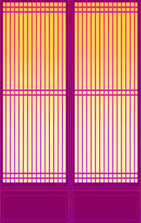
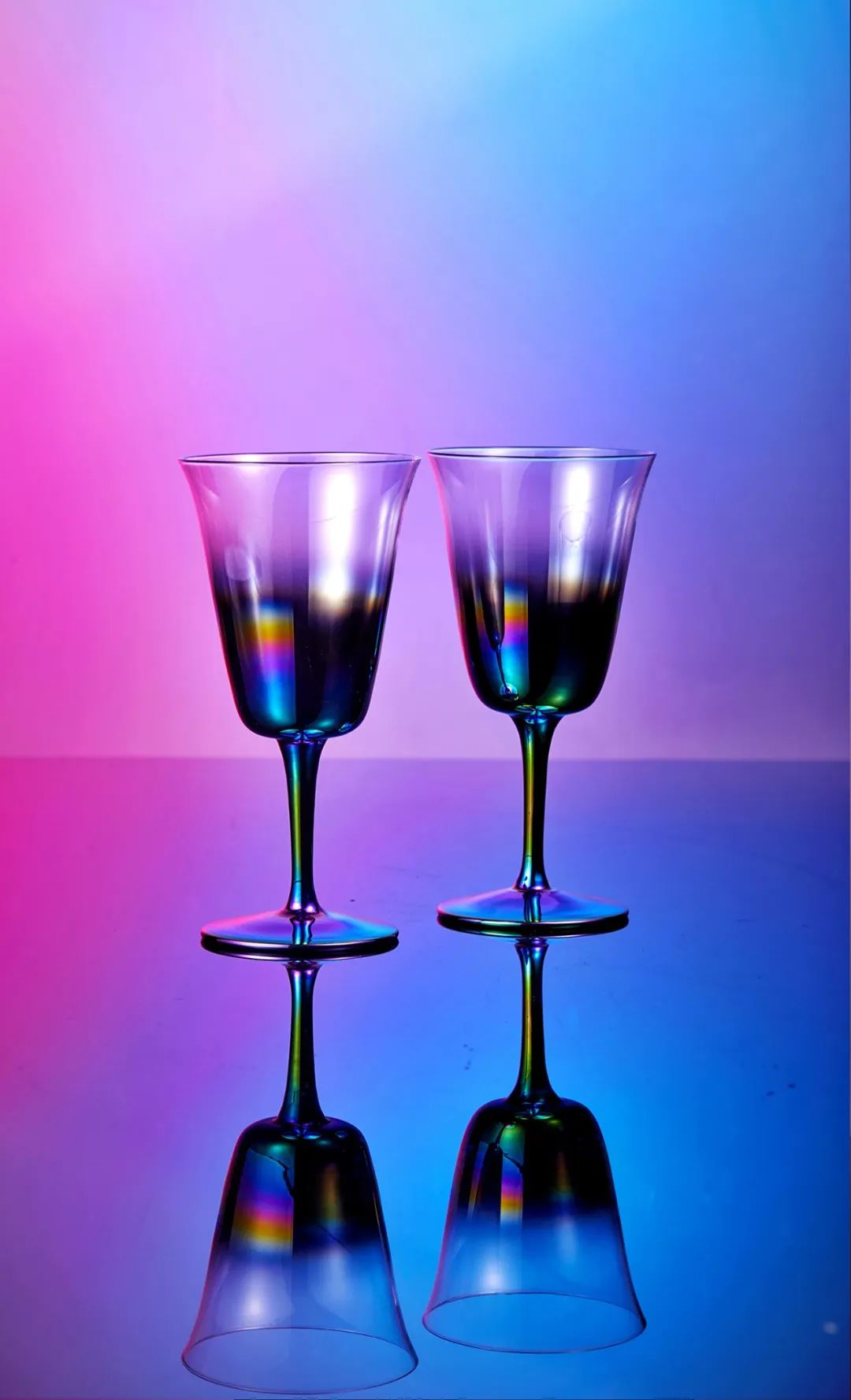
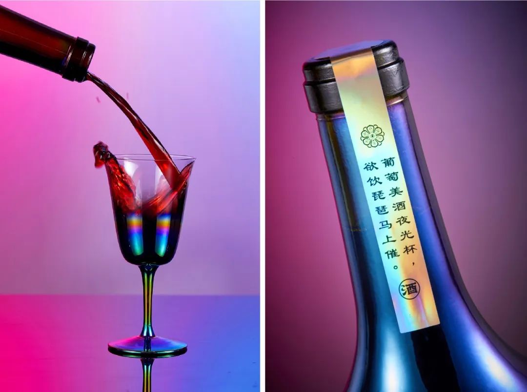
葡萄美酒的灵感创意来自唐诗“葡萄美酒夜光杯”,而品牌咬金的核心理念是盛唐文化,所以我们在瓶身和酒杯采用了电镀和烤漆工艺,呈现出了一种独一无二的镭射炫彩效果,充满了未来神秘感,瓶身上丰腴的唐风美人,半透明炫彩酒杯折射的夜光,让消费者瞬间从现代穿越到2049的赛博世界。
The idea of Yaojin Red Wine comes from a famous poem written by Libai,a Tang Dynasty poet, which describes the wine in a luminous cup and in Chinese people’s eyes that must be precious wine. The core value of Yaojin Brand is the prosperous Tang Dynasty culture. Therefore we use electroplating and painting to make a colorful laser reflection on the bottles and cups. It fulfills mystery when you are influenced by the plump beauty from Tang Dynasty and the lights reflected by translucent but colored wine cup,and they will bring you to Cyberspace in 2049.
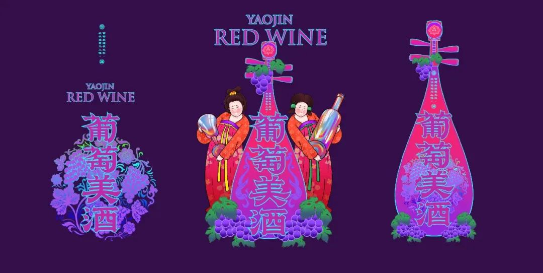


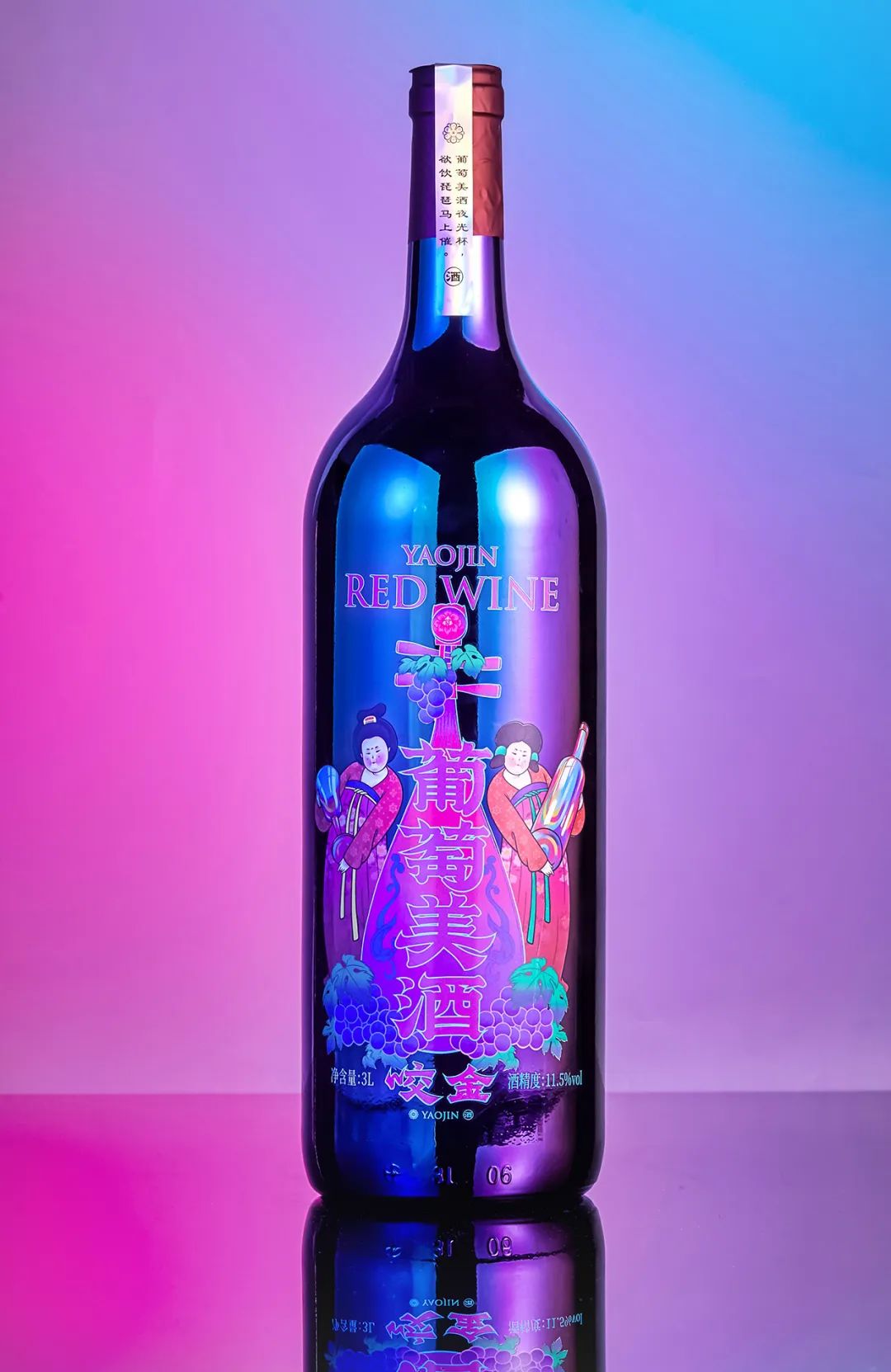
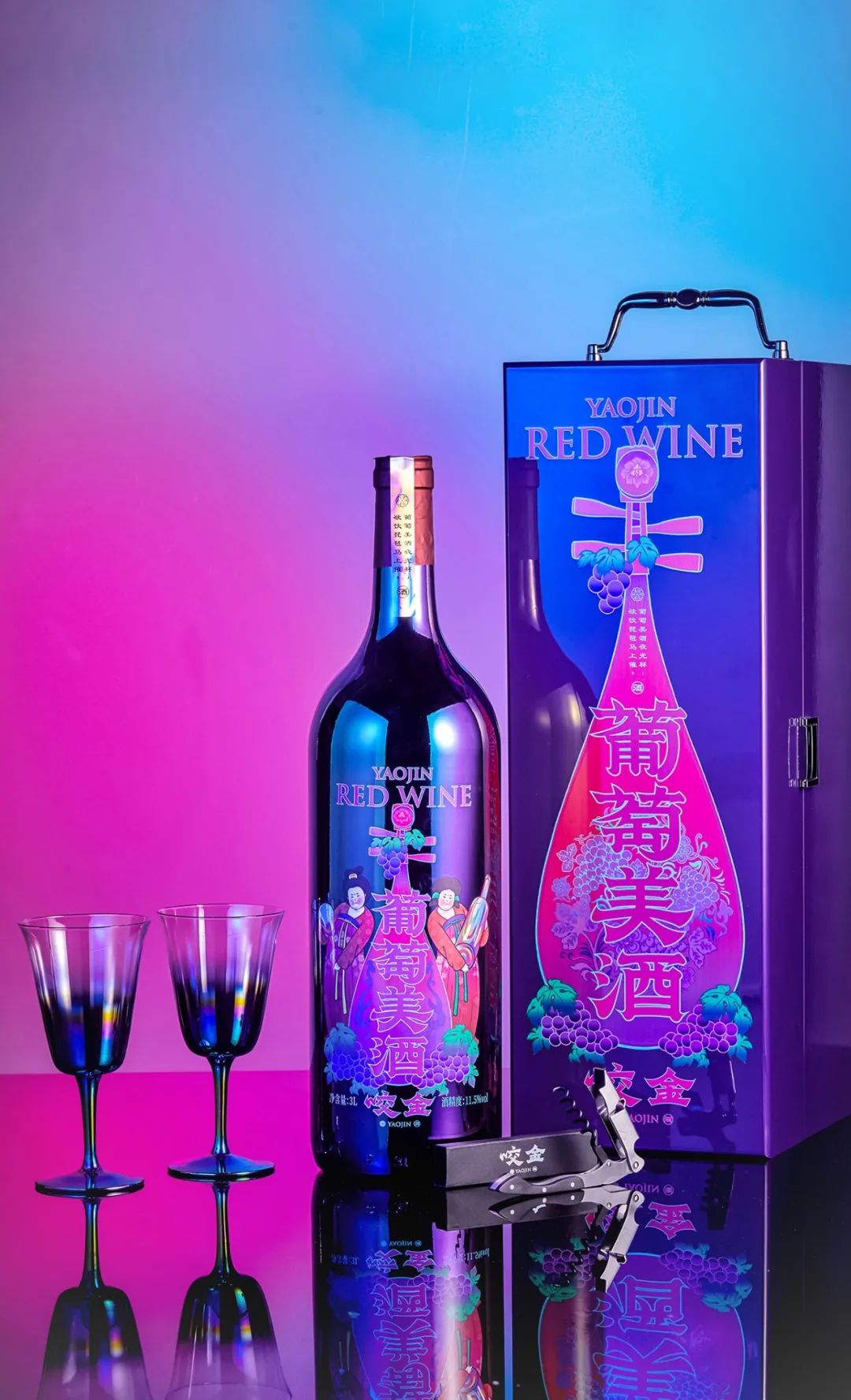
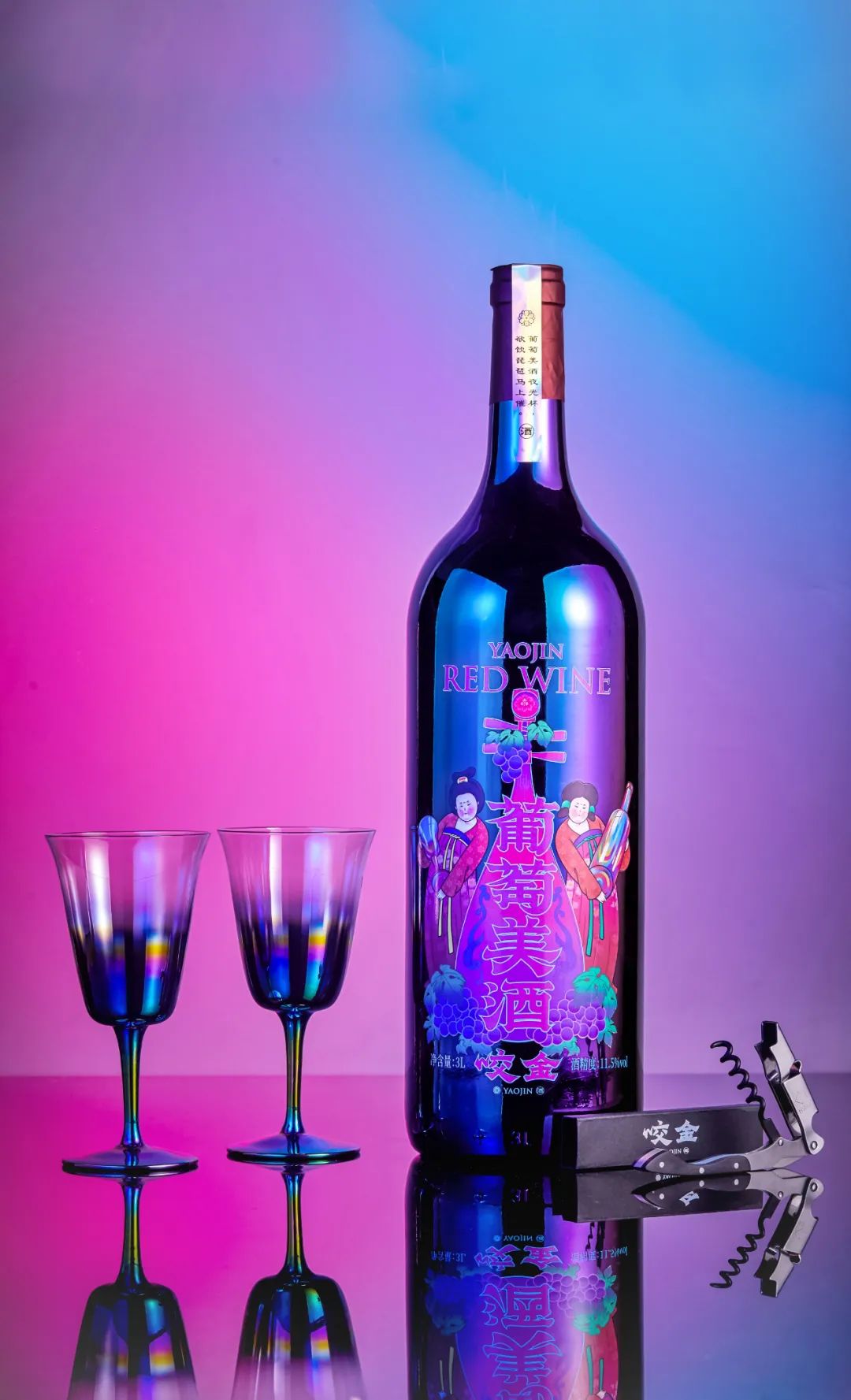
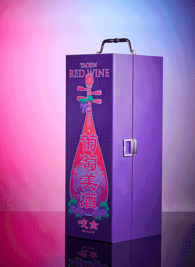
项目: 葡萄美酒产品策划&包装设计
产品策划&文案:Mona,恒尘
设计总监:陈允信
设计师: 林伟淳,尤佳,梁健和,徐程恺
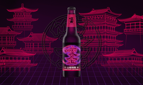

咬金是一个充满国潮风的唐风酒馆,为了凸显品牌国潮和唐风内核,我们采用霓虹灯这种赛博朋克的方式,去重新演绎了汉字,在不同的系列颜色和汉字背后隐藏的唐朝建筑群里,呈现出一种赛博中国的感觉,进一步为消费者植入了品牌形象。

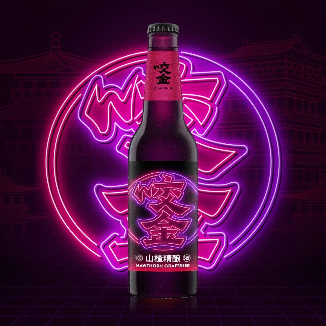
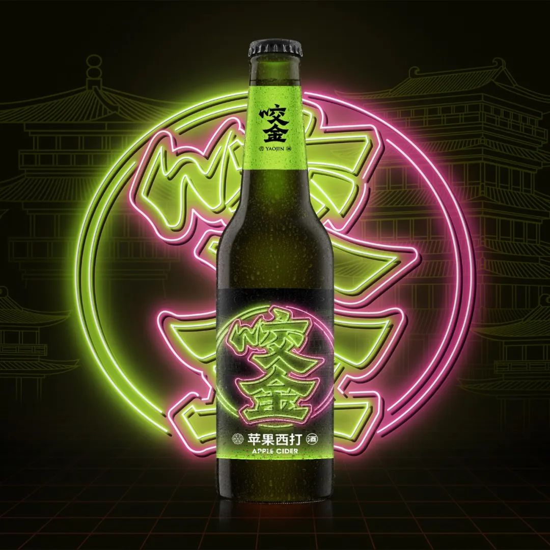
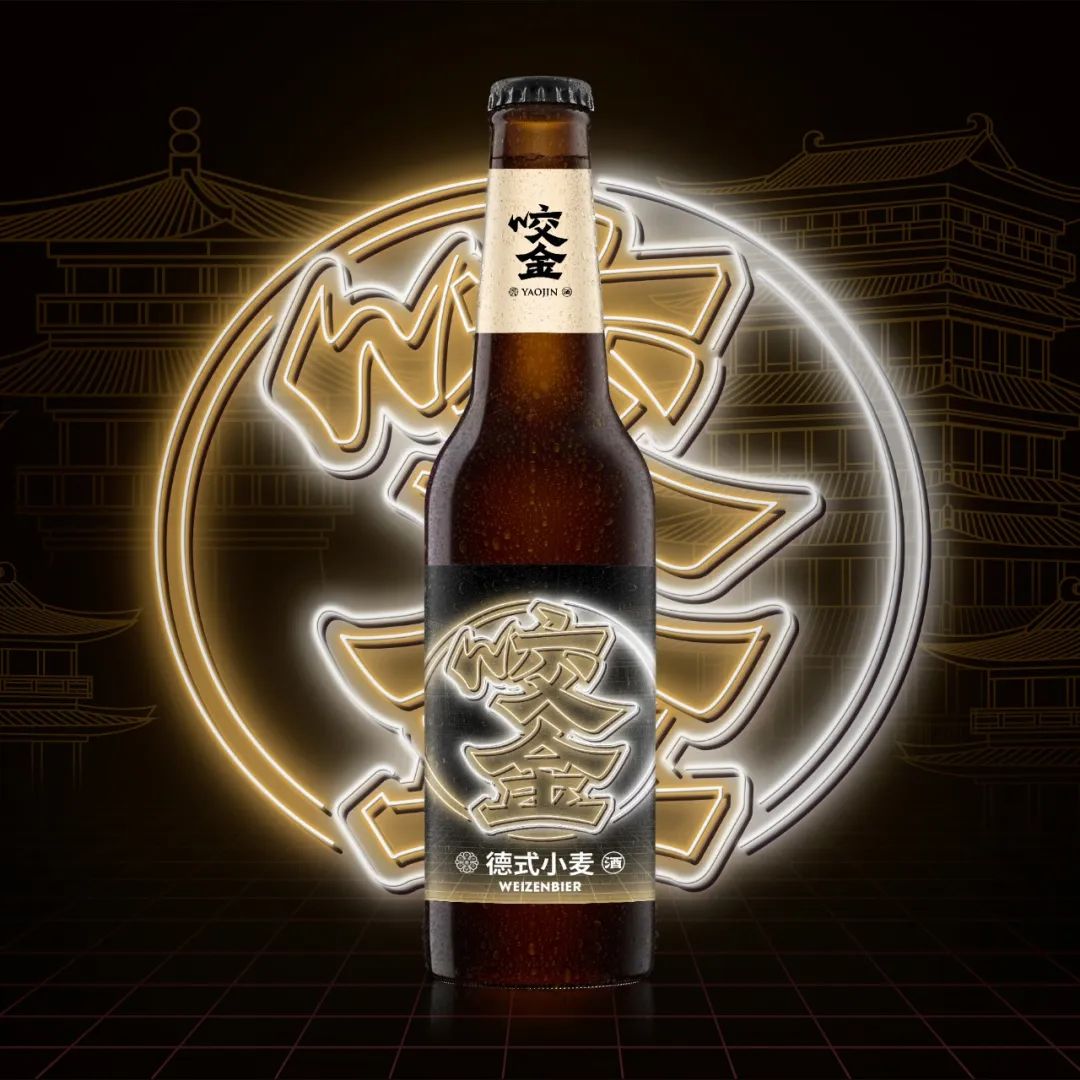
项目: 咬金精酿产品策划&包装设计
产品策划&文案:Mona
设计总监:陈允信
设计师: 林伟淳

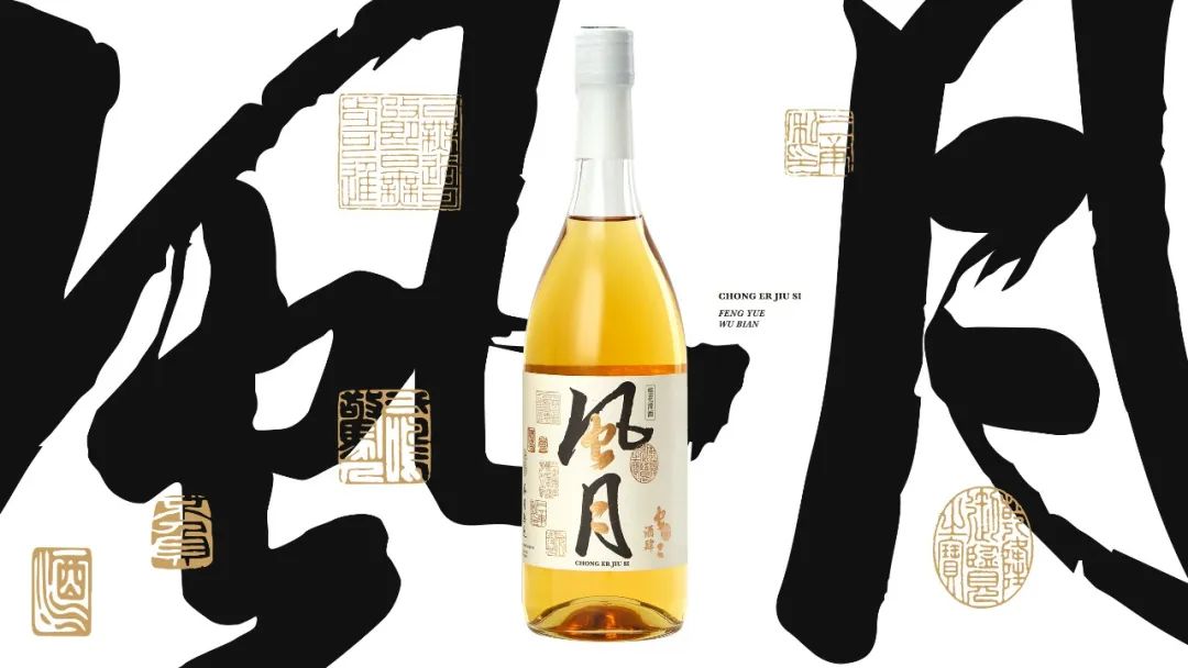

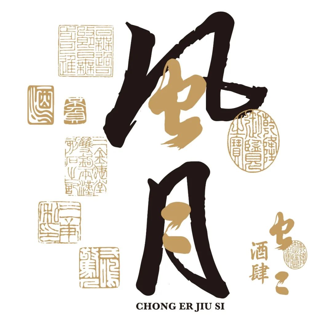
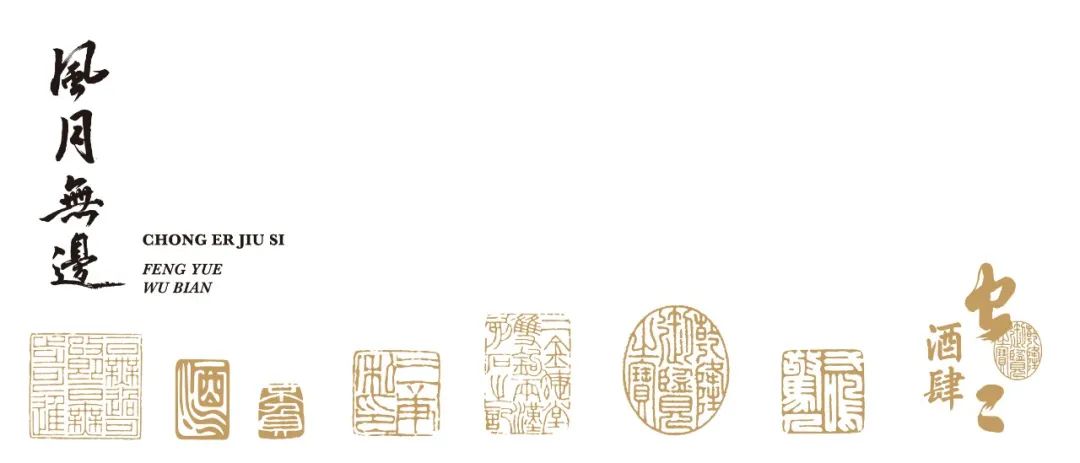


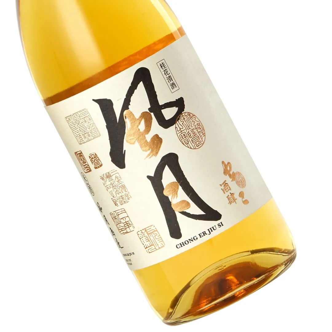
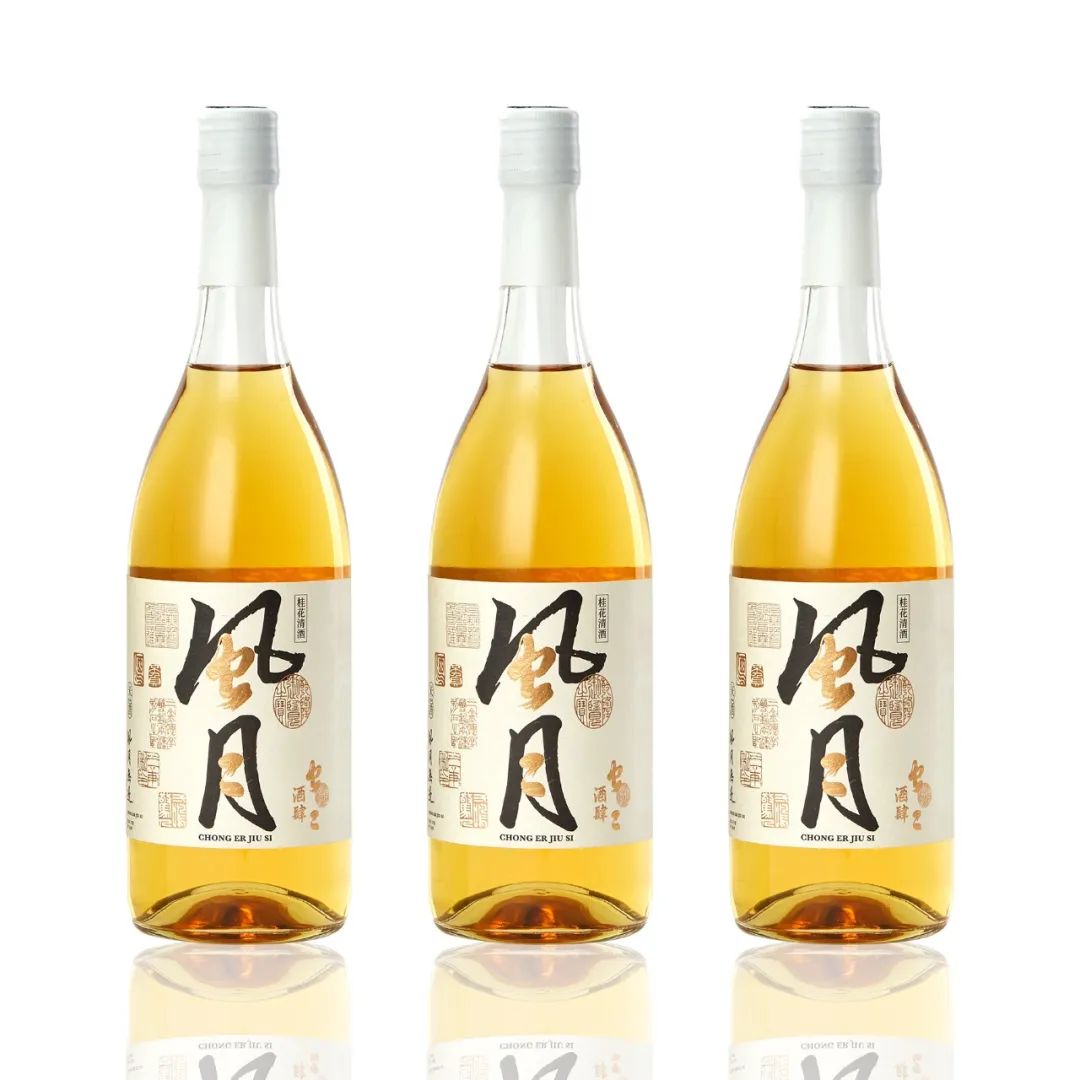
项目: 风月酒产品包装视觉设计
文案:Mona
设计师:陈允信


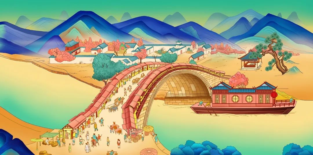
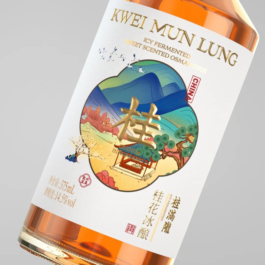
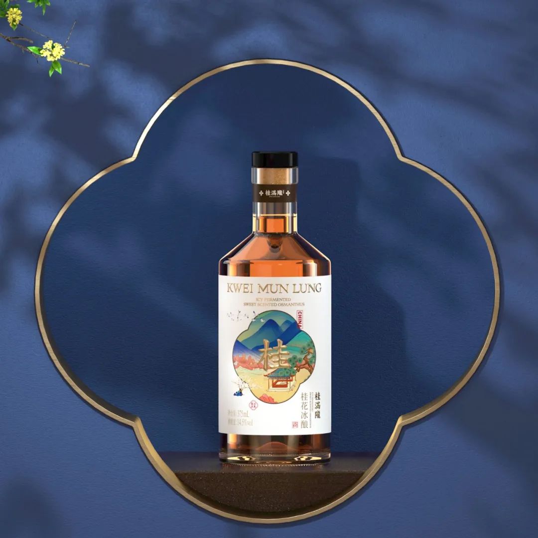
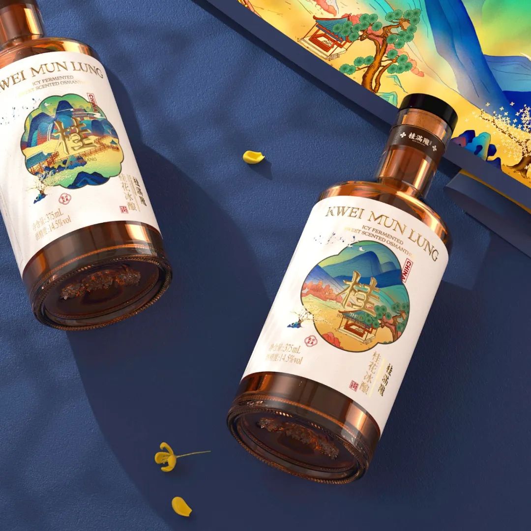
这款产品我们以中文字“桂”为重点,围绕着它进行细致描绘,我们将中国传统文化中的江南景观和字体进行结合。从“桂”字围绕的假山、桂花树、小桥流水中,让消费从这些江南特有的视觉元素中,感知到品牌的文化内核。

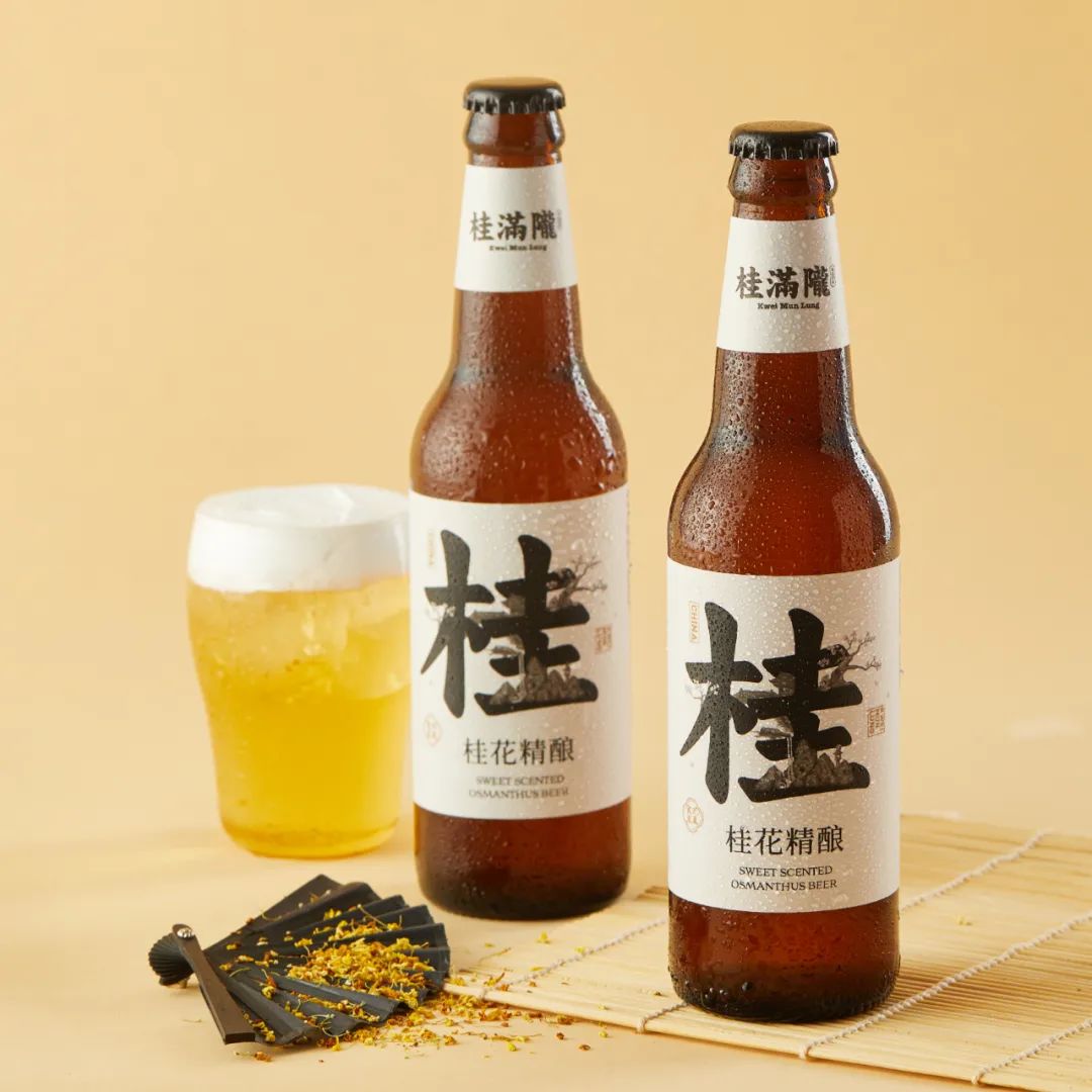
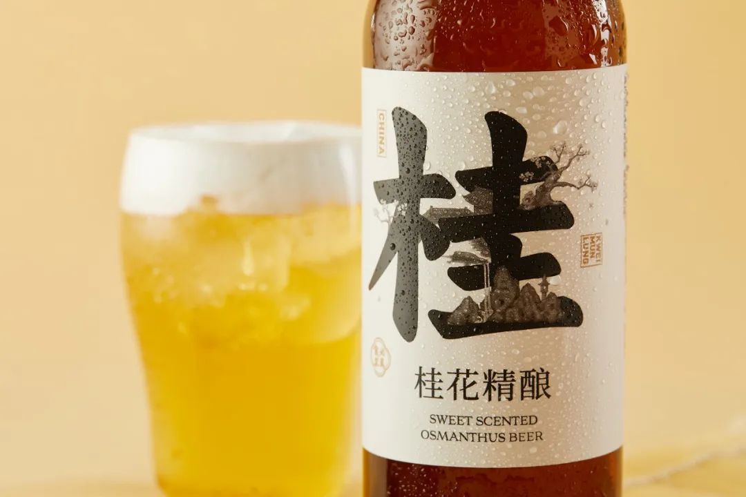
项目: 桂花精酿产品策划&包装设计
策划&文案:Mona
设计总监:陈允信
设计师:梁健和
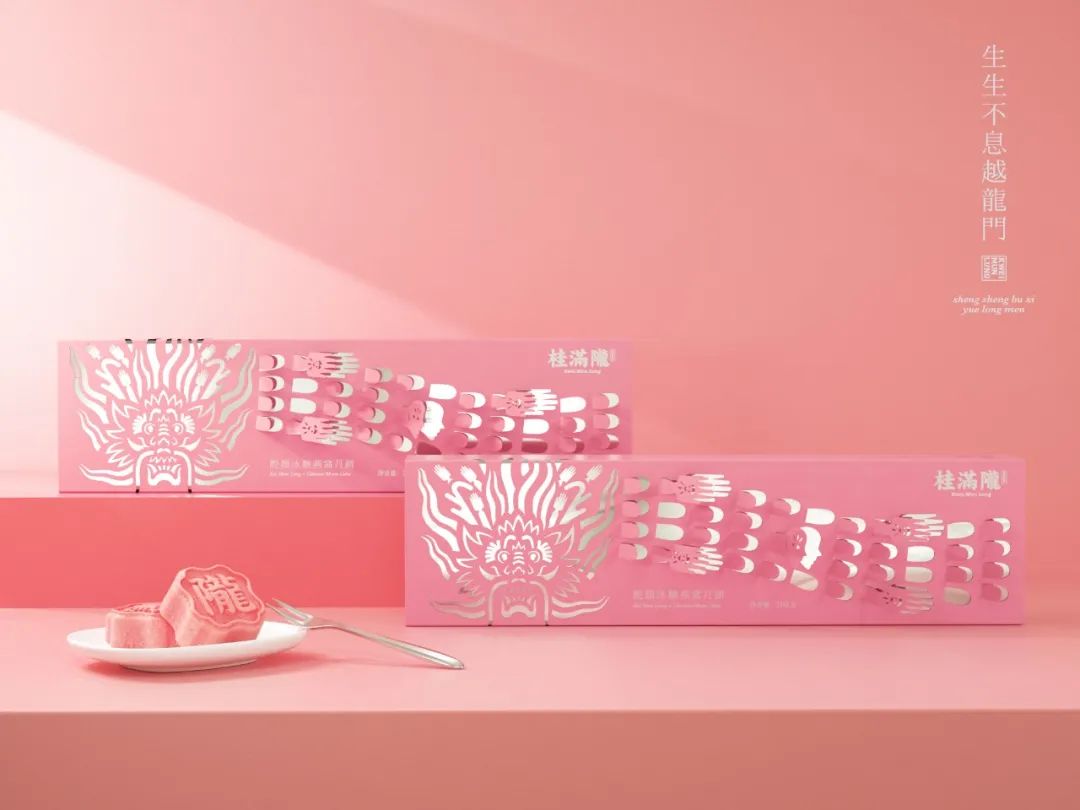

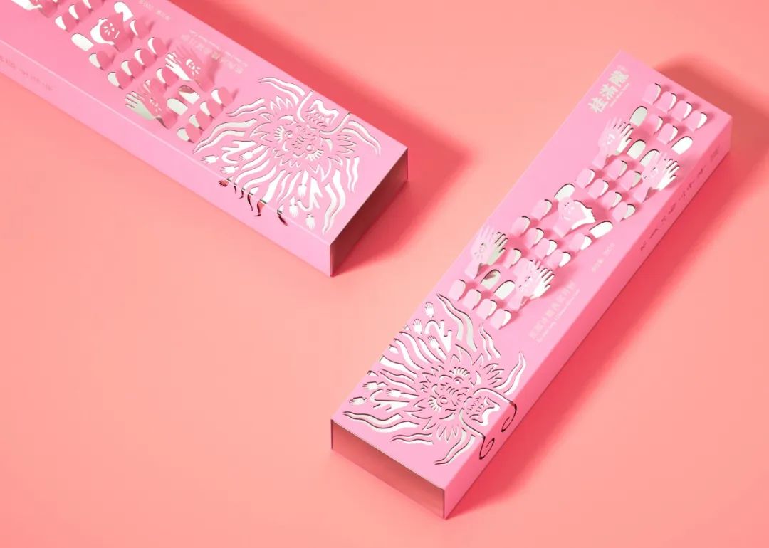
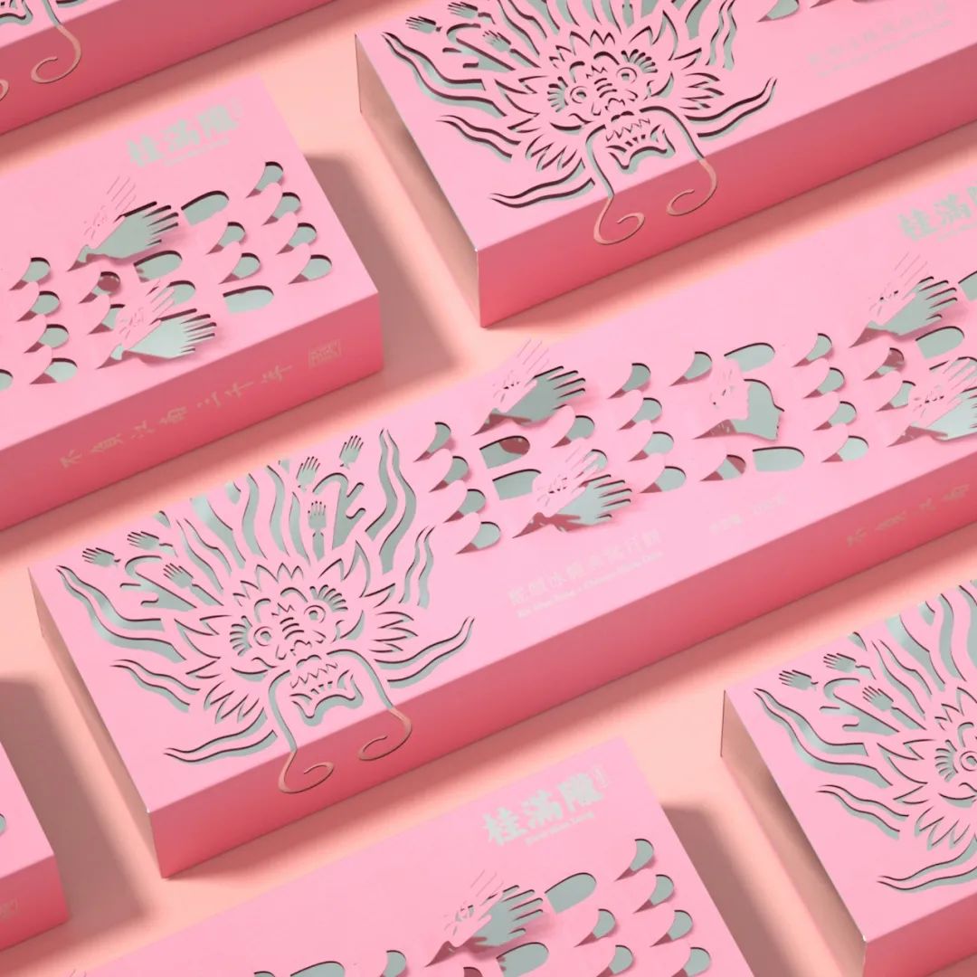
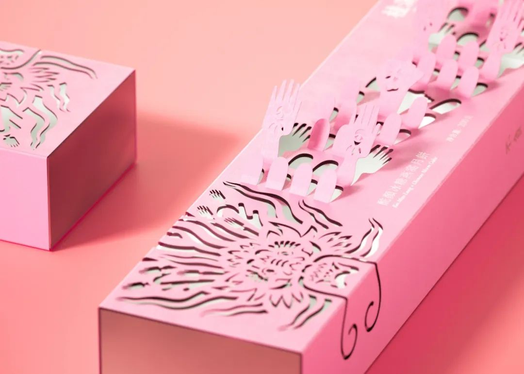
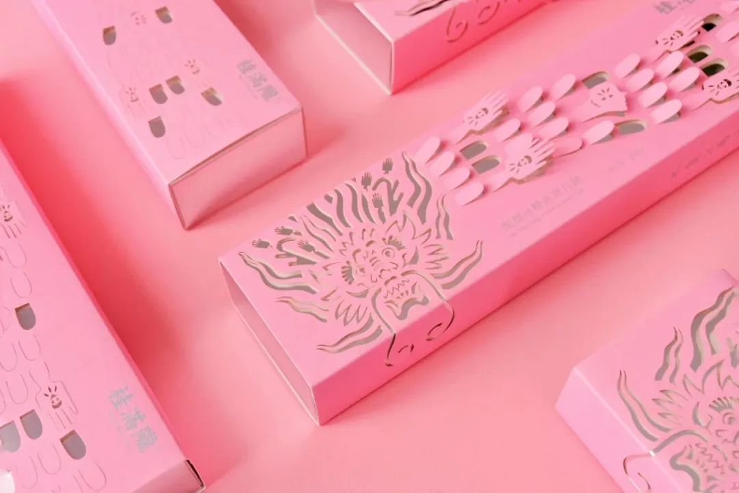
项目: 酡颜月饼包装设计
设计总监:陈允信
设计师:梁健和,林伟淳
版权声明:{{article.isOrigin?'本文系字由用户的原创内容,未经许可不得以任何形式进行转载':'本文转载自互联网,如有问题请通过意见反馈与我们联络'}}


文章评论
还没有人留言
查看更多 >